今天尝试复现两种常见实验图表——细胞生长曲线与肿瘤生长曲线。在R中,我们可以通过ggplot2绘制带误差棒的折线图+散点图来实现我们的可视化需求。在绘制生长曲线图中,需要注意以下几点:
1、横轴通常表示时间,可以是天、周、月等时间单位,也可能是给药浓度/剂量等。
2、肿瘤生长曲线纵轴表示肿瘤的体积、质量或大小,细胞生长曲线纵轴表示细胞的相对数量,不同的实验方法标注截然不同。
3、每个组别的生长曲线通常会以不同的线条或颜色表示,如果组别较多,加之需要添加error bar,组别的颜色需要仔细选择以便区分。
A、细胞生长曲线
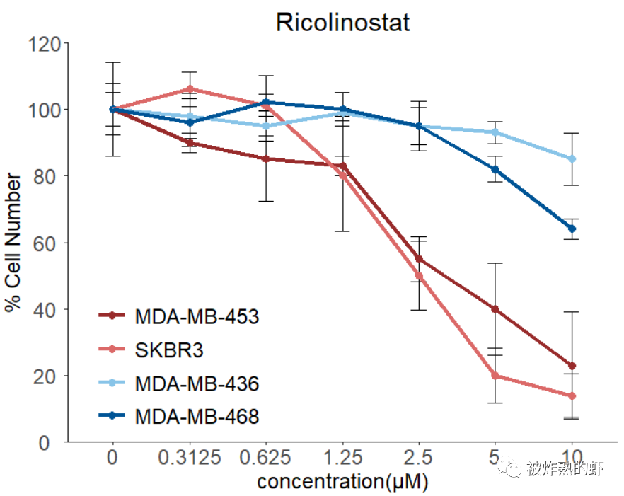
细胞生长曲线是测定细胞绝对生长数的常用方法,也是判定细胞活力的重要指标,它以培养时间为横坐标,细胞密度为纵坐标。这里复现nature cancer上面一篇文章的Fig2e:
Network-based assessment of HDAC6 activity predicts preclinical and clinical responses to the HDAC6 inhibitor ricolinostat in breast cancer.Nat Cancer.2023 Feb;2022 Dec 30.PMID:36585452.
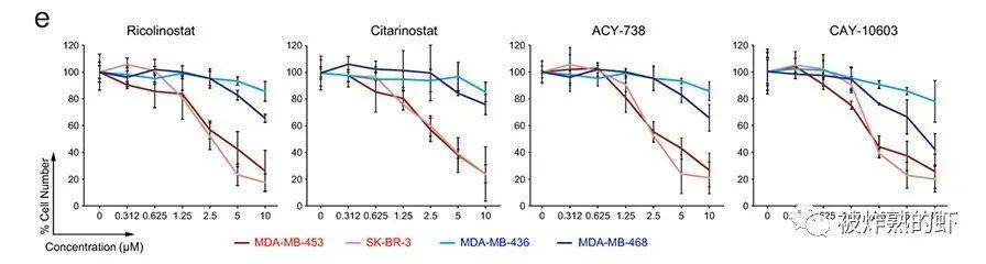
Growth curves of sensitive(S)vs resistant(R)BC cells treated with four different HDAC6 inhibitors(n=3 independent experiments/per drug concentration).All error bars represent Mean±SD.P value was estimated by two-tailed t test.
library(readxl)
library(tidyverse)
##数据整理:ggplot2所需画图格式
Mean <- data.frame(read_excel("./Fig1e.xlsx", sheet = "Mean",na = "NA"))
Mean <- reshape2::melt(Mean[,-1])
StDev <- data.frame(read_excel("./Fig1e.xlsx", sheet = "St. Dev",na = "NA"))
StDev <- reshape2::melt(StDev[,-1])
Scatter <- data.frame(Mean = Mean$value,
SD = StDev$value,
Con = rep(c("0","0.3125","0.625","1.25","2.5","5","10"),each = 4))
Scatter$Group <- rep(c("MDA-MB-453","SKBR3","MDA-MB-436","MDA-MB-468"),7)
Scatter$Group <- factor(Scatter$Group,levels = c("MDA-MB-453","SKBR3","MDA-MB-436","MDA-MB-468"))
Scatter$Con <- factor(Scatter$Con,levels = c("0","0.3125","0.625","1.25","2.5","5","10"))
library(ggplot2)
theme <- theme(plot.title = element_text(hjust = 0.5,size = 22),
plot.margin = margin(0.5,0.5,0.5,0.5,unit = "cm"),#设置画板边缘大小
axis.text.x = element_text(hjust = 0.5,size = 18),
axis.text.y = element_text(hjust = 0.5,size = 18),
axis.title.y = element_text(size = 18),
axis.title.x = element_text(size = 18),
legend.text = element_text(size = 18),
legend.title = element_blank(),
legend.position = c(0.2,0.2),
legend.key.width = unit(1,"cm"),#图例宽度
legend.key.height = unit(1,"cm"),#图例高度
legend.background = element_blank())
Fig_1e <- ggplot(Scatter,aes(x = Con,y = Mean,color = Group,group = Group)) +
geom_errorbar(aes(ymin = Mean - SD,ymax = Mean + SD),color = "black",width = 0.2) +
geom_point(size = 3) +
geom_line(linewidth = 1.5) +
labs(x = "concentration(μM)",y = "% Cell Number",title = "Ricolinostat") +
scale_y_continuous(limits = c(0,120),breaks = seq(0,120,20),expand = c(0,0)) +
scale_color_manual(values = c("#982b2b","#db6968","#88c4e8","#005496")) +
theme_classic() +
theme
Fig_1e
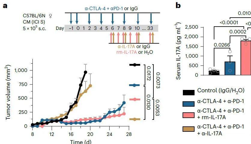
B、肿瘤生长曲线
肿瘤生长曲线图是一种用于描述肿瘤体积、质量或大小随时间变化的图表。这种图表通常用于研究肿瘤在不同治疗条件下的生长情况,或者用于比较不同肿瘤类型之间的生长速率。同样复现nature cancer上面一篇文章的Fig2a:
Interleukin 17 signaling supports clinical benefit of dual CTLA-4 and PD-1 checkpoint inhibition in melanoma.Nat Cancer.2023 Sep;4(9):1292-1308.Nat Cancer.2023 Aug 14;PMID:37525015.
a,Tumor growth kinetics of transplanted CM(BRAF-WT ICI-sensitive)melanoma tumors treated with immunoglobulin G(IgG)or H2O(control),anti-CTLA-4+anti-PD-1,anti-CTLA-4+anti-PD-1+rm-IL-17A and anti-CTLA-4+anti-PD-1+α-IL-17A antibodies according to the depicted treatment schedule.Data points show mean+s.e.m.until the day when the first mice were eliminated from each group.
library(readxl)
library(tidyverse)
##数据整理:ggplot2所需画图格式
Scatter <- read_excel("./Fig-supp.xlsx", sheet = "Fig.2a",na = "NA",skip = 2)
Scatter <- rbind(rbind(as.matrix(Scatter[,1:4]),as.matrix(Scatter[,c(1,5:7)])),
rbind(as.matrix(Scatter[,c(1,8:10)]),as.matrix(Scatter[,c(1,11:13)])))
colnames(Scatter) <- c("Day","Mean","SEM","N")
Scatter <- data.frame(Scatter)
Scatter$Group <- rep(c("Control (IgG/H2O)",
"α-CTLA-4+α-PD-1",
"α-CTLA-4+α-PD-1+rm IL-17A",
"α-CTLA-4+α-PD-1+α-IL-17A"),
each = 20)
Scatter$Group <- factor(Scatter$Group,levels = unique(Scatter$Group))
Scatter$SEM <- ifelse(Scatter$Mean == 0,0,Scatter$SEM)
# Day Mean SEM N Group
#1 8 25.8 5.0 3 Control (IgG/H2O)
#2 9 46.0 10.0 4 Control (IgG/H2O)
#3 10 46.0 10.0 4 Control (IgG/H2O)
#4 11 55.6 16.3 5 Control (IgG/H2O)
#5 12 84.9 16.2 6 Control (IgG/H2O)
#6 13 92.1 14.4 6 Control (IgG/H2O)
library(ggplot2)
theme <- theme(plot.title = element_text(hjust = 0.5,size = 22),
plot.margin = margin(0.5,0.5,0.5,0.5,unit = "cm"),#设置画板边缘大小
axis.text.x = element_text(hjust = 0.5,size = 18),
axis.text.y = element_text(hjust = 0.5,size = 18),
axis.title.y = element_text(size = 18),
axis.title.x = element_text(size = 18),
legend.text = element_text(size = 18),
legend.title = element_blank(),
legend.position = "right",
legend.key.width = unit(1,"cm"),#图例宽度
legend.key.height = unit(1,"cm"),#图例高度
legend.background = element_blank())
Fig_2a <- ggplot(Scatter,aes(x = Day,y = Mean,color = Group,group = Group)) +
geom_errorbar(aes(ymin = Mean,ymax = Mean + SEM),color = "grey",width = 0.4) + #仅展示上半部分
geom_point(size = 5) +
geom_line(linewidth = 2.5) +
labs(x = "Time (d)",y = expression("Tumor volume (mm"^3*")")) +
scale_x_continuous(limits = c(8,28),breaks = seq(8,28,4),expand = c(0,0)) +
scale_y_continuous(limits = c(0,1250),breaks = seq(0,1250,250),expand = c(0,0)) +
scale_color_manual(values = c("black","#1b6292","#ff8080","#c5934e")) +
theme_classic() +
theme
Fig_2a
组间比较统计结果可以在AI或PS里面添加。
相关新闻推荐
1、小檗碱对代表性肠道菌群生长曲线的影响及抑制作用——材料与方法
3、Meta分析方法用于牛结节性皮肤病免疫抗体监测——讨论、结论